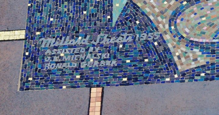
Millard Sheets, Los Angeles County Seal used 1957-2004.
Art in public always has an edge of controversy — what gets included, and what gets left out? What gets preserved and cherished, and what gets removed, destroyed, or painted over? Add to that public sponsorship of iconic art, meant to represent a political body like the Los Angeles County Board of Supervisors and something is sure to burst.
Millard Sheets never shied away from public art, nor from including figures, icons, or religious symbols that he felt were appropriate to the cause. In 1953, Sheets struck a bargain with L.A. Supervisor John Anson Ford to take over the Los Angeles County Art Institute, better known as the Otis College of Art and Design.
Given Sheets’s role and his ties to the Board, perhaps it is not surprising that Kenneth Hahn, another county supervisor, chose Sheets to turn his vision into the new Los Angeles County Seal in 1957. The design represented Los Angeles with a mix of environmental, economic, and historical icons: sun, mountains, and the sea; Pomona, the Roman goddess of fruit trees; an engineer’s triangle and caliper; a tuna for the fishing industry; oil derricks; and the “champion cow Paulette”; the San Salvador, Cabrillo‘s ship; and the Hollywood Bowl, with two stars (for motion picture and television) overhead–and a cross also there, in the sky.

Los Angeles County Seal, as revised in 2004.
In 2004, the seal received three changes: a Native American woman holding a basket replaced Pomona; the oil derricks were dropped and replaced by the Mission San Gabriel Arcangel; and the Hollywood Bowl shifted up–and lost its cross. Together, the three changes tell an interesting story about the changing self-perception of Los Angeles industry and history — but the removal of the cross (done in response with other controversies about Christian symbols on public lands, public buildings, and in official icons) angered some residents, who have, so far, lost their court cases about the change.
What would Millard Sheets have thought? In 1955, under the headline “Art Must Serve Two Masters,” Sheets wrote in the Los Angeles Times that “A good designer has always had to deal with real clients whether king, bishop, or a commercial agency, satisfy their needs and never compromise his [sic] own aesthetic judgment,” and he praised the Board of Supervisors for giving LACAI the ability to train those artists and designers. My sense is that he would have understood that a county seal is a very political item–and so, as times changed, the decision to represent the county differently might come along, no matter what an artist had created.
Thanks to Eric John Abrahamson’s new book, Building Home: Howard F. Ahmanson and the Politics of the American Dream, out now from UC Press, for the reference to that Los Angeles Times piece. Attend a launch event for the book, and/or get your copy today!


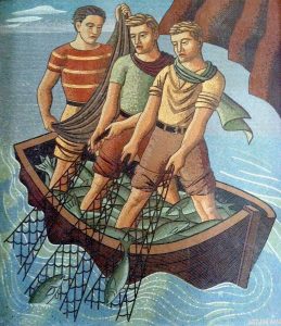


. 1977 Home Savings calendar, courtesy of George Underwood")