Rounding Up Artwork in Houston, Texas

Mailer for the opening of the Cornerstone branch, Houston, Texas, 1987; Denis O'Connor Collection, Huntington Library

Mailer for the opening of the Cornerstone branch, Houston, Texas, 1987; Denis O’Connor Collection, Huntington Library

Come on down for the Texas-size grand opening! “Savings of America” (one of the national names used, because Home Savings of America was taken in Texas) invites you to see the new artwork by “Southwestern artist Sue Hertel”! We are only twenty-two and a half years late — are we still eligible to win the Polaroid Sun 600 camera?

Front of the promotional mailer, 1987

Front of the promotional mailer, 1987

In these weeks when I am not commuting to Texas, I do find Texas popping up all over, including in the announcements for the Cornerstone branch, somewhere in the vast landscape of Houston.

As you can see, these later banks (in Texas, Florida, Illinois, and elsewhere) attempted to provide for the local community the sense of celebration and, at times. history that the original California branches did. Sue Hertel was living in Cerrillos, New Mexico, at this point, sending artwork back to Denis O’Connor in Claremont, so southwestern is probably an appropriate moniker as well.

Cornerstone branch from Cypress Creek Parkway, Google Maps image

Cornerstone branch from Cypress Creek Parkway, Google Maps image

This bank is still standing — take a look at the Google Streetscape image — and the expansion of Home Savings to Texas actually returned Sue and Denis to the state where some of the most magnificent early work of the Millard Sheets Studio, in the Mercantile National Bank of Dallas. A group of local preservationists and businessmen saved those images, finding a six-figure donation to pay for taking out the mosaics. You can read a bit about it here, but that will be a Texas-size effort to discuss another time.

Help Name the Details that Make Sheets Studio Banks Distinctive

HS&L icon tiles, original branch, 9245 Wilshire, Beverly Hills, 1955

It isn’t always as easy as this: “HS&L” icon tiles, original branch, 9245 Wilshire, Beverly Hills, 1955

O.K. lurkers, all of you who view the site but never write comments. I know you are out there — the website stats tell me so. Here is your opportunity for end-of-the-year redemption. And it won’t even require opening your wallet, like all those mailers and pledge drives.

Last week I had a chance to meet with Janet Hansen, Deputy Manager of  the City of Los Angeles’s Office of Historic Resources. We discussed the progress of SurveyLA, a massive building survey out to find out what remarkable (or unremarkable) structures exist within the city boundaries–iconic office buildings, private homes, apartment-building types, gas stations, theaters, all of it.

She was aware of the Home Savings buildings, and we have discussed the existing lists of branches, either from the mid-1980s or today. But of course merely having been a Home Savings branch does not mean the bank location has (or even had) artwork. She asked me a question I want to start to answer here, with your help: What architectural details, colors, media, size, signatures, or other character-defining features make these Sheets Studio buildings special?

Some of the banks were conceived in their totality by the Sheets Studio; others merely received mosaics, murals, sculptures, and/or stained glass, attached to existing buildings. Some received only the projecting cornice and row of gold tiles around the top, and perhaps the travertine facing on the most public side — no real Sheets Studio work, other than to match the most basic elements of the more iconic designs.

Below is my list, roughly working from the most obvious to the more subtle.

What would you include? Once we have a good list, Janet can get it into the hands of the SurveyLA surveyors, and help to identify and preserve these buildings.

  • Signatures/insignia from Millard Sheets (full name in almost all cases); Denis O’Connor (circle with CD inside, for DOC initials); Susan Lautmann Hertel (“SH” initials in most cases) on mosaics and murals
  • Evidence the building was built between 1955 and 1998, and was used as a bank (first Home Savings, then most became Washington Mutual and then Chase)
  • Totally-designed banks are squarish, 2-to-4-story buildings on prominent avenues (often corner lots), have large open spaces inside, originally built as “living-room”-style lobbies; sometimes soaring 2-story ceilings have been cut down by a drop ceiling of a new upper section
  • They also tend to be set back a bit from the sidewalk, with room for sculptures, planters, and sometimes fountains; parking lot in the rear
  • Mosaics, murals, and stained glass, marked by themes of California life, either contemporary or historic, and/or family life; often include horses, almost always figurative, not abstract
  • Mosaics completed in Byzantine (not flat-square) tile, though at times with Italian (flat-square) tiles in background
  • gold Lion of Venice, symbol of Home Savings, or large Home Savings shields (all removed now, I think)
  • Travertine facing on all/most public faces of the building
  • Projecting cornice and row of golden metallic tiles around the top of the facade (some have been repainted other colors, when no longer banks; some have brown bands, without tiles)

That is what I find to distinguish these buildings; anything I have missed?

The First Home Savings: Stained-Glass Windows

Stained-glass windows at the original Home Savings and Loan, 1955

Stained-glass windows at the original Home Savings and Loan, 1955

Happy Thanksgiving Weekend!

While I am at home in San Diego, I thought it was worth going back to the original Home Savings and Loan bank. In the future, I will post more about the original Home Savings mosaic, and the iconic gold HS&L tiles that flanked the other artwork and ran beneath the windows on the bank.

Icon tiles, Home Savings and Loan, 9245 Wilshire, 1955

Icon tiles, Home Savings and Loan, 9245 Wilshire, 1955

But today I want to focus on what surprised me most when visiting the bank this month: the stained glass. I have written about the importance of stained glass at a number of marquee Home Savings locations, and I have found other inaccessible pieces of stained glass.

But the original branch held a double surprise for me: the answer to one riddle, and the beginning of the next .

First, the new riddle: why are so many of the stained-glass windows blocked off? This is somewhat an answerable riddle, by the simple fact that many of them, as here and at Laurel Canyon, reach the full height of the building, and so when renovations are made and second floors become inaccessible to the general public, the glass gets blocked off.

The image above tries to solve this problem by taking the external image–showing the full extent of the window–and reversing it; hence, if you go to see it, those captions will be only visible from inside.

"Roman Thrift and Savings," banking image detail

“Roman Thrift and Savings,” banking image detail

The placement of the new stairway and drop ceiling on the inside make it impossible to see the captions, and I am pretty sure the clear, etched-glass sections are not original, and must replace either broken windows or windows that held Home Savings logos (more research awaits, as always).

But I knew there were captions, and I could make out what I was seeing here, thanks to an early image I saw at the Millard Sheets Studio in Claremont: a single panel of stained-glass work, showing the (Biblical?) scene of an Egyptian-dressed man carrying a calf over his shoulder, with the caption “banking.”

"Banking," Claremont Studio

“Banking,” Claremont Studio

Clearly, this was artwork intended for another project that did not make it–but I also found it a fitting reminder within the Claremont studio of the primary client and benefactor, Howard Ahmanson and his banks. Given what Sheets says about his work on this first bank, I think this window could have gone all the way to fabrication before some design change meant it could not be installed in this bank as planned.

What to make of the imagery? Well, banking is an obvious subject for a bank, and the fine-art quality of these stained glass windows shows the initial desire to make these banks places to linger, to experience beauty. Such a universal history of banking hardly seems to engage the community and the location; of course, this was the first bank, and so those imperatives may not have been clear yet.

The Sheets Studio designed these windows but did not fabricate them; soldering and glass-cutting went on in Pasadena, though Katy Hertel remembers her mother going down to paint all the details onto the glass, so these works can clearly be considered as part of the overall Sheets Studio package. It is very hard to see enough detail here to really be sure, but these windows do not seem to share the style of the later Sheets Studio art–but neither, really, does the mosaic out front, which was fabricated in Italy. (More on all that in the weeks ahead.)

The placement of this window also indicates a pattern present here and at Laurel Canyon, and at Sunset and Vine: sculpture and mosaics in front, stained glass catching its light over the parking lot. That might have been about security for the artwork, but it also suggests the old cathedral trick of the rose window: catch them by surprise with the stained glass. You saw the mosaic out front, you pulled your finned car around to the back, you went in to bank, and then WHAM! on the way out, you look up to a beautiful image you are surprised not to have noticed before, over the door.

So many of these Home Savings banks have been remodeled, and the open doors have been changed, but it is worth considering how the art and architecture work together to create this spectacle.

Intricate Scottish Rite History on Wilshire

Millard Sheets and Studio, Scottish Rite Masonic history mosaic, 4357 Wilshire, 1963

Millard Sheets and Studio, Scottish Rite Masonic history mosaic, 4357 Wilshire, 1963

Last week, I was able to drive along Wilshire Boulevard and see my local string of Sheets Studio art: three banks and this monumental building, the four-story former Scottish Rite temple designed and decorated by the Sheets Studio in 1963.

The property is currently for sale; the Los Angeles Masons (Scottish Rite is one of the traditions of the Freemasons, a fraternal organization with many ties to the symbolism of the United States, as Nicholas Cage and Dan Brown remind us) lost a series of court cases over noise complaints and zoning for the building, and as of 2008 the California Supreme Court denied them the right to lease the property for commercial use.

The legal fight means that the building has been mostly closed since 1993, and completely closed since 2006, so I have not been able to see the Sheets Studio work inside the building (which I hear is extensive).

George Washington, Mason, at 4357 Wilshire

George Washington, Mason, at 4357 Wilshire

4357 Wilshire entrance, with text drawn from U.S. founding documents

I provide here only a few examples of the sculpture and quotations from the building; following the tradition of Masonic structures such as the ornate George Washington National Masonic Memorial, built in 1932, that bridge the known history of the Masons (reaching back to the Enlightenment) with the order’s mythology, reaching back to the time of King Solomon’s Temple, with (as this mosaic and group of sculptures gives evidence to) detours into the law-giving and correct-living precepts of Hammurabi’s Code, a number of early Greek and Roman leaders, the builders of medieval cathedrals, Renaissance leaders, and finally American Founders. As anti-Masonic conspiracy theorists are quick to point out, the vast majority of U.S. Presidents have been Masons, along with other kinds of community leaders. But, without any internal knowledge, I have always seen that as a reflection of these individuals’ power, respect, acumen, and ability to network, rather than its cause.

From what I gather, the 1950s and 1960s was a high point for recent Masonic activity in the United States — a premier networking and campaigning venue, among an association of the established. And, as the later zoning fight about this building reveals, the prominent location on Wilshire, in what is otherwise a residential neighborhood, flanked with massive Protestant churches, indicates the influence of the Masonic group that built this structure.

detail of Babylon with signature, 1963

Detail of Babylon with signature, 1963

Two elements of this mosaic interest me, the first being  its deeply historical nature. Did this commission push the Sheets Studio toward using more history in the Home Savings banks? Next week I will discuss the first Home Savings location, also on Wilshire, that has a mix of historic and ahistorical imagery. Sheets spoke about how he had almost no guidance from Howard Ahmanson–simply a directive to make the art beautiful. Clearly the Masons had very specific ideas about who should be highlighted, what text should be included, and what gestures, symbols, and clothing would best express Masonic principles. I wonder if Sheets and his collaborators enjoyed the research project, and/or if the reception suggested more historical images would work well.

The other element is the mosaic’s style. Thanks to my experience with Alba Cisneros a few weeks ago, cutting tile and comparing Byzantine and Italian tile styles, I can recognize this Scottish Rite mosaic as a transitional moment. In his oral interview in the 1980s, Sheets discussed how the original mosaics were made in Italy, but that, given his disappointments with the results, he began to train himself and his studio in the creation of mosaics. This mosaic was made in California, but the signature technique — Byzantine tile, carefully cut and shaped — is not present throughout; there there are large sections of flat, square Italian-style tesserae, which are machine-made. Perhaps the sheet size of this four-foot mosaic is to blame, but I wonder if Sheets, Denis O’Connor, and others were still perfecting their mosaic tile. More interviews and more time in the archives will tell.

Image of the Week: Dating Mosaics and Thinking of Home in San Diego

"The Harbor," Mission Bay Drive at Garnet, San Diego, c. 1975-1977

"The Harbor," Mission Bay Drive at Garnet, San Diego, c. 1975-1977

Last Friday I had a chance to sit down with Alba Cisneros — a mosaic artist who worked with Millard Sheets and Denis O’Connor for 17 years — and Katy Hertel, Susan Hertel’s oldest child (a stepdaughter), herself an artist and, like many of the artists’ children, a sometime worker in the mosaic studio.

Sitting at a mosaic-composition table, surrounded by cans and cans of tile, trying my hand at cutting and shaping a tile (not very well), we talked about many of the stages in the history of the mosaics — and I gained a good amount of insight into composition and dating of the mosaics.

In December I plan to return to the task of creating a comprehensive list of the Home Savings locations with Sheets Studio art and architecture — and which are threatened (for now, this list which I am no longer updating will have to do).

But one of the key questions is dating the works — which was from the Sheets-Ahmanson period, ending with Ahmanson’s death in 1968? Which is before Sheets turned over all of the Home Savings work to Sue Hertel and Denis O’Connor, in about 1980? Some archival files exist, but the expertise of Alba Cisneros, who started working for the studio in 1975, can, with others, help to date the artwork even when file, newspapers, or other sources come up short.

Alba remembers working on this mosaic, and has pictures of it in her personal files — and Katy looked at many of these images (I think this one among them) and said, “That’s my brother!” I learned that Sue Hertel — working every day in the Sheets Studio, then returning home to her children and a house full of horses, goats, and chickens — often drew inspiration for her family scenes directly from her own home, with family portraits included in each embrace.

San Diego Children's Zoo, c. 1975-1977

San Diego Children's Zoo, c. 1975-1977

Katy and I specifically addressed the Westminster Mall family, which I discussed a few weeks back; this companion to “The Harbor,” showing, ostensibly, the San Diego Zoo’s children’s pavilion, seems to also reflect what I have heard about the Hertel homestead. (Both of the images, facing the parking lot, can be seen together here; I will come back to the masculine portraits on the front of the bank another day.)

I grew up in San Diego, going to the San Diego Zoo, caressing the chicks, seeing the orcas at Sea World (the world’s first, which opened with Shamu in 1964), playing in the tidal pools, riding the Balboa Park miniature railroad, standing near the California Tower, cavorting about the clipper ship The Star of India, and going out to the Point Loma lighthouse; in recent years, I have been privileged to do many of the same things with my toddler.

So the sense of place, of what San Diego is like for a young family, is very strong for me in these images. But, as we have seen, Sue Hertel blended her own family history into the images and ideas of the place she was depicting — and the San Diego Zoo was not allowing any elephant rides in my memory. So the images are, as we have seen, a mix of the specific and the generic, the historic and actual and the nostalgic and fanciful.

One more note on the mosaic workmanship and the dating of the images: Alba explained that, originally, each element of the mosaic would be placed within the travertine facing of the banks — and even small elements like trees or the silhouette of a sail would be carefully cut out. But after a while some cost-cutting did occur, by making more rectangular, easy-to-install shapes, and/or, as you can see in this image, using broken travertine to fill in the background and allow for the smooth visual connection to the rest of the building, without the difficult cutting.

Alba also explained that, once the mosaics were installed, members of the Studio would get up on ladders and stain elements of the image, to cover the grout, for example, with the dominant color. I think we can see a further element of “cheating” here, as the tops of the trees in the Children’s Zoo image seem to be merely painted onto the travertine above the mosaic.

I’m glad that, this Thanksgiving, I will have a chance to revisit these images, alongside my family.

The Case for Preservation in Pomona (and for Communication from Chase Bank)

Home Savings tower, Pomona, 1963

Home Savings tower, Pomona, 1963

In the past month, scaffolding has gone up around the Home Savings tower in Pomona, at the corner of Second and Garey. Local preservationists were disturbed at this development; less than fifty years old, and part of the modernist moment in art and architecture just now being preserved in Pomona, Los Angeles, and across the nation, they were worried about what exactly was going on. (See news and comment.)

Questions have been raised, from what is Chase Bank’s intentions, to whether such a tower is worth preserving. So this week I will take those ides on–in reverse order.

Why preserve this tower? Well, the first thing to know is that it was conceived as part of the same project as the Pomona downtown mall, a novel project for its time in using the allure of downtown, plus a few fountains, sculptures, and mosaics, to draw in locals on their lunch break and visitors to town. Built as a pedestrian mall, the Pomona downtown mall was one of the earliest examples of the attempt to replicate the shopping Main Streets that anchored thousands of U.S. towns in the era before the highways overran that landscape.

If that doesn’t speak to you, consider the building’s interior:

Susan Hertel and Millard Sheets, Pomona, 1963

Susan Hertel and Millard Sheets, Pomona, 1963

A wall-to-wall painting by Millard Sheets and Sue Hertel, one of the first (if not the first) which she signed, marking her transition from Scripps College art student to full-fledged member of Sheets’ artistic studio. The jagged-shaped birds, rolling abstract hills, and horse motifs seem very much like Sheets, but there is a warmth, both in this painting and the outside mosaic.
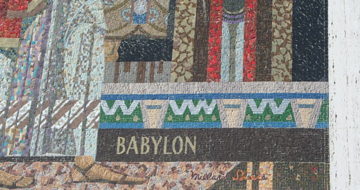
Pomona mosaic, 1963

Pomona mosaic, 1963

This suggests the scenes of family embraces, curvilinear, organic shapes, and subtle but striking color choices that would mark much of Hertel’s best work as a painter and Studio member for decades to come.

The mosaic is near-impossible to remove; as long as the building is standing, it will be there, one assumes. And the painting, though massive, must have found some way in; it is probably on panels, and so, if Chase needed to remove it, it could.

But that leaves the overall design of the building itself, something no one photograph can really capture. Once you look closely at the window latticework, you can see the H-S of Home Savings, one of the marks of the early, “signature” banks personally overseen by Millard Sheets and Howard Ahmanson. (Some of the later iconic elements — a golden lion of Venice symbol by the door, and the marble facing — are also present.) As some have noted, Sheets’ Studio provided artwork for about 160 banks, but the partnership of Ahmanson and Sheets only worked comprehensively on about 45 banks, before Ahmanson died in 1968.

I have not been inside the upper floors, so I have no idea what it is like to work there today; it is a modernist icon, but like many modernist architectural icons, the spaces could be poorly adjusted to the needs of modern office life, or they could be perfect.

My first hunch is that the scaffolding is nothing to worry about; Chase Bank has had trouble with the painting over of a fresco mural in San Francisco, and the removal of the paneled mural in Pasadena, but it seems Tony Sheets (Millard’s son) has been able to work with the company — when the public and the media are alert enough to get him involved. And there is the California Art Preservation Act, which (with its federal counterpart) should at least help slow any changes to a considered pace.

But what is really needed is a true commitment from Chase Bank, to learn about the work of the Millard Sheets Studio, and to create a general plan for how the bank will steward this art and artwork.

The Sheets Studio work was the pride of Home Savings, financed, researched, carefully crafted, lovingly maintained, even through remodels. Washington Mutual, by all accounts, was quite aware of this heritage when they bought the banks, and they seem to have considered how best to maintain that Home Savings ambience in these branches.

But Chase, on the other hand, seems to have brought in their own models, angering customers and losing the local touch in the meantime. This very Pomona branch has a key example:

Pomona painting and Plexiglass

Pomona painting and Plexiglass, Chase Bank, 2010

The Plexiglass that Chase has installed in front of the tellers, distorting and blocking the view of the Sheets-Hertel painting. The same seems to be true in many of their bank locations — the need to place white-and-blue themes, the perfect logos, and these Plexiglass shields (which of course make me feel less safe when I am banking, because the bank is telling me there is something to fear). Home Savings intended their banks as a place individuals could spend time, discussing their investment options, resting their feet, enjoying the “living room” feel; Chase seems to want you to come and go quickly, and if you want a personal touch, perhaps the ATM would be better.

Somewhere, Chase has the institutional records of Home Savings; through projects like mine, and interviews with those involved in the creation and preservation of this art and artwork, JP Morgan Chase Bank could be part of the process of honoring and understanding the gift that Howard Ahmanson, Home Savings, and the Millard Sheets Studio gave to California. In a few cases, Chase has made the effort and paid the expenses for restorations — but these are counterbalanced by the ignorant mistakes made to destroy the artwork in other branches, the lack of communication in cases like Pomona.

So the scaffolding in Pomona can be a wakeup call — both to alert preservationists and bank customers, to ask questions and be sure to announce any such changes. But more importantly, it should be another chance for Chase Bank to truly engage with the history of the art and architecture of the Sheets Studio banks — and to have a chance to be part of the community , as Home Savings and Washington Mutual were, aware of the local history and tradition — and not just another anonymous, disliked national chain.

Image of the Week: Location, Location, Location in Westminster

My computer has returned, and with them my images — but there are still some loose ends that prevent me from posting my own photograph today.

However, I was pleased to be contacted by M. Danko, who has begun producing lovely photographs of the Home Savings bank art at http://socal-bank-art.blogspot.com/.

As I mentioned earlier, I was in Westminster for a planning meeting linked to my other Southern California avocation, the Past Tense seminar at the Huntington Library. Getting off the freeway, I saw this bank, and then had to maneuver a collection of one-way streets, frontage-ways, alleys, and parking lots to get back to where I could see the bank.

This is a “late” image, near the date Millard Sheets turned over these commissions completely to Susan Hertel and Denis O’Connor. It shows Sue’s styling — flowing lines, organic motifs, family groupings, beautiful abstract trees, contrasting colors. According to the city’s history page, Westminster was known for its temperance colony, and then for “the world’s largest goldfish farm” (probably a large farm, not a large fish) — I can’t say I see any of that represented here. It seems more of a generic design — happy, embracing family, no real connection to the local history, something that does characterize a good number of the artworks.*

Westminster branch, set back from the curb

Westminster branch, set back from the curb

From another of the SoCal-Bank-Art images, here, you can see that the bank is set back on the lot, its parking behind; what this Google Maps aerial shot reveals is that behind that is the 405 freeway and the Westminster Mall.

Westminster bank location

Westminster bank location

This is a hard bank to get to, I realized, and I wondered if it had always been so. The Westminister Mall was built in the 1970s, so it seems the bank always related to its neighboring properties as it does today; perhaps once the streets were not one-way, when the freeway was less crowded, but this Home Savings location was clearly aimed at mall patrons, much as the Pomona location anchored one end of the downtown pedestrian mall.

This artwork–especially, by the 1970s, when it would have been instantly recognizable to southern Californians–clearly serves in part as a billboard here; the dimensions are about the same, and the combination of the setback and the roadways suggest it was intended to be seen from the car, not admired by passersby.

Indeed, the mall seems essential to the identity of Westminster, California — so much so that Westminster city officials have a satellite office, City Hall at the Mall, to cater to their constituents. So while the bank does not have the approachability of, say, the Sunset and Vine location, it still serves an iconic function, saluting all those that enter the mall, the heart of this community.

*I am trying to provide a new and more comprehensive list/map/timeline of the Home Savings bank art, characterizing some as “historical” along with other themes. I have had a chance to interview some of the architects involved with siting and designing the Sheets Studio work; I am also in touch with those who installed, fabricated, and restored the works, and I am trying to keep abreast of the preservation challenges. So, keep posted, and keep in touch with any leads!


Image of the Week: California History Encapsulated in Studio City

California history encapsulated at Laurel Canyon

California history encapsulated at Laurel Canyon

Now that we have taken a tour of all the various media used by the Millard Sheets Studio, I will focus in on the images and juxtapositions that first drew this historian of nineteenth-century North America to this project about post-World War II Southern California.

Before I learned that there were so many, and so varied, artworks in the Home Savings banks, my mind fixated on the history images, in grand, prominent locations, like the parade of figures at Garnet in San Diego, the collection at Sunset and Vine, or this mosaic, commanding an entrance to the San Fernando Valley in Studio City.

In four figures, this Sheets Studio mosaic tells one story of California history, expanding on the history of “From Oranges to Oscars” discussed last week. The Franciscan friars came to Christianize California’s Indians; California’s frontier was a place of vaqueros, ranching and cowboying according to Spanish and Mexican traditions before the coming of American control; the gold rush changed everything; and, in this rendition — presto! California was ready for the magical transformations of Hollywood moviemaking.

Clearly, a lot is missing from such a history. But I would rather focus on what draws these four scenes together, and how they might have been chosen to tell their story together, on the bank facade, in giant figures.

First, these are clearly picturesque moments in California history, moments long remembered for their adventure or intrigue or possibilities. As I have noted, there is an attempt to tell happy, uncomplicated stories — no Okies arriving out of the Dust Bowl, no Zoot Suit riots, not even the proud shipbuilding of Californians during World War II. We academics now have a greater sense of the displacement caused by the Missions and the gold rush, but they remain storied moments in the public’s perception of California history. And perhaps their rootedness, their long histories, was intended to rub off on the new movie business, and the new bank in the still-newly-suburbanizing San Fernando Valley.

Are the images about history, or about movies? Given the gaps and the connection to nostalgia, it can be hard to distinguish the two. The camera does point left, taking in the dramatically dressed woman but also, perhaps, the character drama of a Franciscan friar, a vaquero, or a prospector, each a common figure in the radio dramas, films, and television shows of the twentieth century.

One formal question to ponder, too: Why the tricolor background? Merely to highlight the colors, and give a chance to add depth to the figures? Or something about the amounts of marble needed for such a large space? One more thing to research, I suppose.

Image of the Week: Howard Ahmanson and the Home Savings Art

An excerpt of "From Oranges to Oscars"

An excerpt of “From Oranges to Oscars,” showing the stars to be honored and Home Savings president, Howard Ahmanson, 1968

The Millard Sheets Studio could create the fantastic art of these banks because they had the financial backing of the Home Savings banks, to create these ornate and expensive pieces of artwork. Hence, as much as Sheets, Denis O’Connor, and Susan Hertel can be credited for these gifts to California, the financial muscle and some of the visionary designs should be attributed to Howard Ahmanson.

Howard Ahmanson Sr. had been born in Omaha, Nebraska, and, while attending the University of Southern California, founded H.F. Ahmanson & Co. In 1947, the holding company purchased Home Savings and Loan; in the decades that followed, the bank profited from lending to the residents of new tract homes and other houses throughout southern California, in its boom years. In the mid-1950s, Ahmanson built a Home Savings along Wilshire in Beverly Hills, his first second (see comments) experiment in a partnership with Sheets’s studio; given the enthusiastic response from depositors, Ahmanson continued the arrangement, as good for business and for the community. Tragically, Ahmanson died of a heart attack in 1968, at the age of 62 61, while traveling abroad with his family. (This quick bio is derived from the account in Vickey Kalambakal’s recent article; a true Ahmanson biography is underway.)

This image of Ahmanson and the Hollywood stars he wished to honor at Sunset and Vine comes from a brochure that Home Savings produced to celebrate the bank’s opening, titled “From Oranges to Oscars.” Once again, the whistle-stop tour of California history is on display; more about that another time.

From Oranges to Oscars

From Oranges to Oscars

But the text here is itself a remarkable peek into the intentions of the artwork:

Now the past and the future combine in “The Home of the Stars.” Home Savings has dedicated its new Hollywood office to keeping alive the colorful history of Sunset and Vine…

“Civic leaders have expressed Hollywood’s need for such a monument,” said Mr. Ahmanson [who died soon after the bank’s opening, on a trip to Europe]. “By providing such a landmark, with no cost to the taxpayer, we can show our gratitude to a wonderful community which has been so nice to Home Savings.”

Could the artwork be intended merely as a thank you? Or would the promise of increased attention and free publicity for a grand opening lead to more deposits and hence profits? Did actors and movie professionals generally like banking at a place decorated by the images of their craft? Did anyone dislike these mosaics — not for artistic choices, but for something about the mere idea of public art upon a bank?

Not to seek out cynicism and discord — even as an academic, we can believe in happy stories — but I do hope to learn more about the economics, the cultural choices, and more that went into creating these images. I don’t think there was a tax break awaiting the creation of beautiful, rather than merely functional, bank spaces, so I do hope to learn more about the motivations, for Sheets, his studio, and their first Home Savings patron, Howard Ahmanson Sr.

Image of the Week: Panorama of Pomona Valley, in the new home of AMOCA

AMOCA future location

Millard Sheets mural "Panorama of Pomona Valley," 77 feet long and 7 feet tall, in a former Pomona First Federal becoming the new home of AMOCA. Photograph courtesy of Christy Johnson

I am proud to be part of a big announcement in Pomona arts! Here are excerpts from the letter from Christy Johnson, director of the American Museum of Ceramic Art:

I have great news! Mr. David Armstrong, AMOCA’s Founder, and his wife Julie are buying a nearby building in Pomona that David plans to make into a new home for our museum. The building is the former home of Pomona First Federal Bank at 399 N. Garey Avenue. The building itself is historic, exuding a mid-century modern décor, and the pièce de résistance is a Millard Sheets mural in the main room, “Panorama of Pomona Valley,” 77 ft. long & 7 ft. high, portraying a 100-year span just prior to the founding of the city. When the structure has been renovated to meet AMOCA’s needs, the Armstrongs will make the space available to the museum just as they have at our current location, for the last six years.

As a way of introducing this project, AMOCA is holding an open house at the new building on Sunday, October 17, from 2:00 to 4:00 pm. This is your opportunity to get a sneak peak at the spacious building, before the renovation begins. Wine and refreshments will be served.


AMOCA educates by presenting, collecting, and preserving significant ceramic achievements, past and present. To meet its objective, AMOCA has amassed a 1000-object permanent collection. The museum’s educational program stresses the unparalleled, cross-discipline value of ceramics: it is an art; a science; and a key to interpreting history.

And now, AMOCA will be able to expand their display space, develop ceramics studios, and more, in the expansive, prominent new space on Garey Avenue.

As Christy mentions, the museum’s move will benefit fans of Millard Sheets Studio art because this massive mural will be accessible to the public once again. Pomona First Federal was one of Sheets’s first bank clients; if my sense of the situation is correct, his artwork for the local chain predated his work with Home Savings. But Pomona First Federal was closed by the FDIC in 2008, as a “failed” savings and loan; hence when I drove by the Garey location in August with Brian Worley, we could only see the outside of the locked and empty buidling.

The location is a prominent one in Pomona, between the downtown mall and the freeway (and train) access points; it will helpfully expand the revitalization of Pomona’s downtown area around its vibrant arts history — and present, and future.

I have not been able to see this canvas mural in person, so I will comment on the image you see above, and some crosscurrents with other Sheets artwork. As Christy states, the mural depicts the hundred years of change before the opening of the bank (my records suggest 1957 for this location). The two centuries from the arrival of Junipero Serra and the mission system, through Mexican independence, the U.S. acquisition of California, the gold rush, and further town-building and modernizing is a favorite Sheets Studio time period.

As I will discuss in coming weeks, there are figures seen as representative and beloved that appear again and again — vaqueros, American Indians, Victorian ladies — but this mural (at least the section above) seems very engaged with the native peoples of the region, their customs and rituals, and how the establishment of the mission (at the center-right of the image above) brings change, for better or worse, to the native patterns of the region.

Sheets grew up in Pomona and loved horses — and his love for the region, and its specifics within the general history of California, come through here. Sheets also collected “pre-Columbian” Native American art, something I am learning more about. But clearly the influence of such ceramics and other artwork is on display in the colors and choices Sheets makes in depicting indigenous people — always with dignity and distinction, in the artwork I have seen, equal partners in the encounter of civilizations that marked the “discovery” of the Americas by Europeans.

I do look forward to celebrating with AMOCA in the coming months and years, and I am glad that David Armstrong will be securing its future!