National American Fire Insurance 3731 Wilshire: The First Sheets-Ahmanson Collaboration

Millard Sheets, National American Fire Insurance, 3731 Wilshire, 1954 (demolished). For sale at Art-Books.com, Alan Wofsy

Millard Sheets, National American Fire Insurance, 3731 Wilshire, 1954 (demolished). For sale at Art-Books.com, Alan Wofsy

Eric Abrahamson’s new book, Building Home, describes the first interactions between Millard Sheets and Howard Ahmanson, and says some about the National American Fire Insurance building. It is crucially important but hard to document, since its demolition in the process of the construction of the Ahmanson Center.

The images you see here come from the remarkable collection of mostly color sketches for sale via Alan Wofsy Fine Arts, in San Francisco; these and more appear on their website, with prices and other details. But my work in the Ravenna Mosaic Company papers have provided more insights about their fabrication and installation.

Millard Sheets, Firemen at Work sketch, for Ravenna Mosaic Company fabrication, 1954. For sale at Art-Books.com, Alan Wofsy

Millard Sheets, Firemen at Work sketch, for Ravenna Mosaic Company fabrication, 1954. For sale at Art-Books.com, Alan Wofsy

In the early 1950s, Sheets and the Ravenna Mosaic Company did work for Mike Lyman’s restaurant (unclear which one — they were once at 424 W. 6th St, on Pershing Square according to designs in the Library of Congress Winold Reiss collection; and 1627 North Vine in Hollywood and Hill at 8th downtown, according to this matchbook or Mike Lyman’s flight deck at the airport, in this old footage— all now demolished) as well as the Precious Blood church in Los Angeles. They also discuss a General Insurance building mosaic on Wilshire — which may have been for the building at Wilshire and La Brea by that name — but if so, it is gone too.

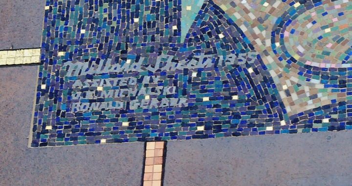
What we do have, however, is discussion of “the Firemen’s Panel” that the Ravenna Mosaic Company had done for Sheets–and the installation diagrams.

The mosaics were of course to large (and too heavy) to ship all put together, so the practice was always to create segments of the mosaic–normally pasted, face first, onto paper–and then stack and ship them to the installation site. (As we have mentioned here, you have to be careful to keep them safe from water as well as infestations, lest the paste be eaten and the design destroyed.)

And so, in order to get the installation correct, you needed a map of the mosaic, matching the pieces back into the correct order. They existed for every installation, but they were mostly destroyed — but it just so happens that the Ravenna Mosaic Company kept a copy, when they sent another to Sheets for installation.

Ravenna Mosaic Company, General [National American] Fire Insurance Building, Los Angeles, 1954-1955, courtesy of Saint Louis University Libraries Special Collections. Special thanks to John Waide.

Ravenna Mosaic Company, General [National American] Fire Insurance Building, Los Angeles, 1954-1955, courtesy of Saint Louis University Libraries Special Collections. Special thanks to John Waide.

And though it is referred to as the “General Fire Insurance Company,” and it is also along Wilshire, it is clear from the shape that it was the mosaic over the door at the National American Fire Insurance Company of Howard Ahmanson, at 3731 Wilshire — and the start of a remarkable partnership in art, architecture, and urbanism.


Garden Grove and the Birth of the Sheets Studio Mosaic Style

Apropos of my talk this month in St. Louis, many of March’s posts will draw upon the eye-opening information in the Ravenna Mosaic Company files at St. Louis University, which John Waide has helped me access.

The files on this mosaic from Garden Grove have helped me resolve an ongoing question raised by conversations with mosaicist and mosaic historian Lillian Sizemore: Where does the Sheets Studio mosaic style come from, and why does it change so often? We have discussed the Ameses, the role of Martha Menke Underwood, and the later innovations of Denis O’Connor, and the last mosaics fabricated in Italy, but the questions around the initial mosaics, 1954-1960, remained: Is the style the work of Millard Sheets, or the imprint of his fabricators? Were the fabricators Italian, or Ravenna Mosaic (who are actually German), or Sheets’s own studio?

Now the Ravenna Mosaic Company records can provide an answer, in the form of a complaint.

On February 29, 1960, Arno Heudeck, of the Ravenna Mosaic Company, wrote to Millard Sheets about the cartoon received for the “proposed mosaic mural for the Home Savings & Loan Association. Garden Grove,” saying “we have studied it quite carefully.” But then there is a concern:

“You have indicated…your suggestion for handling the style, size, and texture treatment of the tesserae for this mural, including large sized tesserae. Your selections of colors and shading are beautiful, but very vast in numbers. I think it is clear that you are indicating a great deal more time-consuming work for us in your specifications. All our tesserae, it seems, will have to be cut and fitted in irregular patterns and fields; even you plain gold areas are broken up in an interesting, but obviously more time-consuming manner for us.”

And so they wrote with a higher price quote–which Mary Dane, secretary-treasurer (and all-around keep-things-working administrator) for Millard Sheets accepted on April 1, stating as “I relayed to you via telephone sometime ago: It is not necessary to break up all the areas that way (refering [sic] to your letter)….those area which are not definitely cutup [sic] into patterns may be done with regular cutting…For example, the foliage on the trees could be done with some areas fitted in regular pattern and most areas cut simply.”

On September 14, 1960, Heudeck wrote back, to ask for photographs of the finished installations, and “to ask how these last two murals we executed for you were received by you and your clients,” given “the unique manner in which you installed these mosaics into the sandblasted recessions of the marble,” and their “interpretations of the cartoons into the mosaic medium.”

Thus, it is clear that the innovations of Sheets’s design that gave it depth and life– the plane-splitting diagonal lines, the articulation of variegated color, and the contrasting colors — were innovations for the Ravenna Mosaic Company, and required a new technique (and greater cost) than their normal procedures.

Given a discussion of work for Arcadia (see my next post), it seems the Sheets Studio was already doing some mosaic work in-house–likely including the small paintings/mosaics for Compton. But by 1961, with the arrival of Martha Menke Underwood and then Denis O’Connor as  members of the Sheets Studio, they began to do all this work themselves, beginning with the Scottish Rite Temple in Los Angeles. But this letter — its surprise, its wonder, and its admiration — demonstrates when Sheets’s new style for mosaics began to emerge, despite the difficulties it left for his fabricator.

Millard Sheets and the Los Angeles County Seal

Millard Sheets, Los Angeles County Seal used 1957-2004.

Millard Sheets, Los Angeles County Seal used 1957-2004.

Art in public always has an edge of controversy — what gets included, and what gets left out? What gets preserved and cherished, and what gets removed, destroyed, or painted over? Add to that public sponsorship of iconic art, meant to represent a political body like the Los Angeles County Board of Supervisors and something is sure to burst.

Millard Sheets never shied away from public art, nor from including figures, icons, or religious symbols that he felt were appropriate to the cause. In 1953, Sheets struck a bargain with L.A. Supervisor John Anson Ford to take over the Los Angeles County Art Institute, better known as the Otis College of Art and Design.

Given Sheets’s role and his ties to the Board, perhaps it is not surprising that Kenneth Hahn, another county supervisor, chose Sheets to turn his vision into the new Los Angeles County Seal in 1957. The design represented Los Angeles with a mix of environmental, economic, and historical icons: sun, mountains, and the sea; Pomona, the Roman goddess of fruit trees; an engineer’s triangle and caliper; a tuna for the fishing industry; oil derricks; and the “champion cow Paulette”; the San Salvador, Cabrillo‘s ship; and the Hollywood Bowl, with two stars (for motion picture and television) overhead–and a cross also there, in the sky.

Los Angeles County Seal, as revised in 2004.

Los Angeles County Seal, as revised in 2004.

In 2004, the seal received three changes: a Native American woman holding a basket replaced Pomona; the oil derricks were dropped and replaced by the Mission San Gabriel Arcangel; and the Hollywood Bowl shifted up–and lost its cross. Together, the three changes tell an interesting story about the changing self-perception of Los Angeles industry and history — but the removal of the cross (done in response with other controversies about Christian symbols on public lands, public buildings, and in official icons) angered some residents, who have, so far, lost their court cases about the change.

What would Millard Sheets have thought? In 1955, under the headline “Art Must Serve Two Masters,” Sheets wrote in the Los Angeles Times that “A good designer has always had to deal with real clients whether king, bishop, or a commercial agency, satisfy their needs and never compromise his [sic] own aesthetic judgment,” and he praised the Board of Supervisors for giving LACAI the ability to train those artists and designers. My sense is that he would have understood that a county seal is a very political item–and so, as times changed, the decision to represent the county differently might come along, no matter what an artist had created.

Thanks to Eric John Abrahamson’s new book, Building Home: Howard F. Ahmanson and the Politics of the American Dream, out now from UC Press, for the reference to that Los Angeles Times piece. Attend a launch event for the book, and/or get your copy today!

The Global Process of Home Savings Mosaics

Denis O'Connor, Sue Hertel, and Studio MosaicArt di D.Colledani-Milan, mosaic, Savings of America, Springfield, Missouri, 1986. Note the goof at installation that reversed the SH of Sue's signature at bottom right.

Denis O’Connor, Sue Hertel, and Studio MosaicArt di D.Colledani-Milan, mosaic, Savings of America, Springfield, Missouri, 1986. Note the goof that reversed the SH of Sue’s signature at bottom right.

Mosaic is an ancient art. Around the Mediterranean, but especially in Italy, mosaic traditions go back millennia. And there was nothing obvious about Millard Sheets’s decision to include mosaics in his initial designs for Home Savings — though, along with stained glass, travertine, gold leaf, and classicist references in modernist designs — they contribute to Sheets’s goal of helping a new financial institution feel timeless, perhaps even eternal.

Lillian Sizemore, a mosaicist and a scholar of mosaics, has helped me understand more about the unusual/innovative choices made over the decades by the Sheets Studio, primarily by Denis O’Connor, in the fabrication of the Home Savings mosaics. She and I have discussed how the Sheets Studio likely garnered its mosaic skills from Arthur and Jean Ames, who created New Deal-era mosaics at Newport Harbor Union High School, and taught technique to students (including Martha Menke Underwood and Nancy Colbath) at the Claremont Colleges.

My research has suggested Millard Sheets first designed mosaics that were fabricated by the Ravenna Mosaic Company of St. Louis, in the 1930s and 1940s, before building his own fabrication team. And, like mosaicists around the world, the Sheets Studio ordered its best tiles from Italy (with some additional ones from Mexico), making it hard to use materials to track the mosaic fabrication process.

What we see here is the other end of the spectrum — when, after Millard Sheets retired, Denis O’Connor and Sue Hertel continued the business — they became overwhelmed by the requirements of the rapidly expanding Savings of America.

Lillian has helped me see how and where O’Connor ordered mosaics to be fabricated in Italy, at less cost, via a broker named Franco Merli at NOVA Designs. (Denis segregated the records about these Italian-fabricated mosaics, either as a matter of file management or to keep this change out of the spotlight.) The work was done by Studio MosaicArt di D.Colledani-Milan, which has a nice website highlighting their ongoing mosaic work.

Offshoring the mosaic fabrication was cheaper, but, as Lillian has shown me, it also led to changes in the fabrication techniques, which she is tracking. Unfamiliarity with the themes, figures, and even animals intended by the sketches lead to discussions, in a mix of Italian and English, in the files.

This mosaic, in Springfield, Missouri, then suffered another goof — the fabricators did not correctly reverse Sue Hertel’s initials — and no one at the installation noticed to fix it.

For one of the new national Savings of America branches, far from other branches and from the context and story of the Sheets Studio and Home Savings, this was insult to injury.

One expects there were foreheads smacking from Missouri to California to Italy when the mistake was pointed out.

Jean Goodwin Ames and Arthur Ames: Ancestors of the Sheets Studio Mosaics

Jean Goodwin (later Ames), “Three Women Gathering at the Sea Shore,” Federal Art Project mosaic for Newport Harbor Union High School, 1937.

When Millard Sheets first designed mosaics, he sent them off to be fabricated by the Ravenna Mosaic Company of St. Louis, run by the German Heudeck family.  It was only after he crossed paths with Jean Goodwin Ames and her husband Arthur Ames that Sheets could imagine fabricating mosaics in California.

Jean and Arthur met in a MFA ceramics class with Glen Lukens, at USC, where Jean created her first majolica tile mural in the Science building, Youth and Science, as her MFA thesis (image here).

Arthur Ames, “Three Fisherman,” Federal Art Project mosaic for Newport Harbor Union High School, 1937.


Goodwin and Ames both were involved in the Federal Art Project of the Works Progress Administration, and Jean, in an oral history, said that Arthur’s professor at the California School of Fine Arts, “Ray Boynton…inspired me to do the work in mosaic and so we were one of the first to do mosaic work in California and it was through his expression we did that.” (They also mention the influence of Dr. Robert King and the help of Bob Vohe.)

Bruton Sisters, “St. Francis” mosaic, San Francisco Zoo, 1934. Image via Vicki & Chuck Rogers on Flickr.

The Ameses were part of a veritable movement of artists, especially in California, learning the art of mosaic in the 1930s. According to the research of Lillian Sizemore, mosaicist and mosaic researcher, as well as Sharon Musher, a historian of the New Deal arts projects, Maxine Albro and the Bruton Sisters were employed through the Federal Arts Program in the Bay Area (including at the San Francisco Zoo), where, in the words of the Ameses, they acquired mosaic skills from “imported workers” from Italy who had come to work on mosaics at Stanford, among other locales.

The mosaics that the Ameses produced for Newport Harbor

Union High School were likely among the first public mosaics fabricated by Americans in the state of California. The preponderance of square tiles; the heavy, dark lines; and the massive, static feel of the figures do not bear the mark of the later Sheets Studio mosaics, reflecting more the large figures of the contemporaneous Mexican muralists, and Soviet Socialist-Realists.

The material is also different. As Jean later said, “at that time it was almost impossible to get the Byzantine [glass] mosaic [tesserae] that is used in Italy, and we used native material,” hard, high-fired matte vitreous (clay) tiles from scrap heaps as well as tile from manufacturers such as Gladding McBean. But the interplay of colors to create depth, and the cut tiles that provide hints of motion—in the women’s hair, in the pelican’s feathers—show the promise of how their technique evolved.

Jean and Arthur Ames were married in 1940, and Millard Sheets recruited Jean to the faculty at Scripps College, while Arthur became Professor of Design at Otis Art Institute.  Their artwork moved progressively through a number of media—paintings to mosaics to woodcuts to copper enamel to tapestries, and, in most cases, from figurative to abstract compositions.

Jean and Arthur Ames, tree mosaic for Ahmanson Trust, 9145 Wilshire, 1959-1960

The Ameses did a few mosaic commissions for the Sheets Studio – at Claremont United Church of Christ; at the Mercantile National Bank building in Dallas; at Ahmanson Trust in Beverly Hills; – as well as enamels and a lion for the first Home Savings, at 9245 Wilshire.  Their interview also mentions a majolica tile mosaic for Guaranty Savings in Fresno, and work for “the Pomona Loa,” under the direction of Millard Sheets — but I am unsure what exactly that was, and its fate.

The influence of the Ameses at the Sheets Studio was mostly through the skills endowed to their students who worked in mosaic – Martha Menke Underwood and Nancy Colbath most prominent among them. The mosaic at the first Home Savings mosaic, completed 1955, is signed with the names Millard Sheets, J.E. (likely James Edgar) Michalski, and Ronald Gerber—and I am still trying to track down who these last two individuals were.

Millard Sheets, J.E. Michalski, and Ronald Gerber, mosaic for Home Savings, 9245 Wilshire, Beverly Hills, 1955. Photo via Vickey Kalambakal.

From Millard’s encouragement and Martha’s skill, the Home Savings mosaics emerged—small in size and intricacy at first, and then ever larger and more complex. After 1961, when Denis O’Connor came into the studio, Lillian Sizemore has described to me that this shift marked “a more modern trend in the Studio’s handling of the mosaic surface.”

In 1999, Newport Union demolished the building where the mosaics were, outside facing a patio—but, thankfully, their wall was preserved. They now occupy pride of place in a hallway at the entrance to the school, with a plaque describing their history.

Next week we will look at what happened after the grand era of Denis O’Connor mosaics for Home Savings — when his smaller operation could not handle the timing demands of Home Savings, expanding across the nation.

Putting (Home) Savings of America on the Map

Savings of America maps, 1990s. Courtesy of Larry Upham

Savings of America maps, 1990s. Courtesy of Larry Upham

Happy 2013, everyone!

On Monday, I had the opportunity to interview Larry Upham, who worked for nearly three decades on the construction of new Home Savings branches. (He even got his start, after Korean War service, in rock work at Millard Sheets’s Claremont studio via Arlen Eddington – and later did the same at Barking Rocks, in Gualala.) Upham’s career at Home Savings spanned the expansion throughout the LA Basin, on to San Diego and San Francisco, and then to other states, where Upham oversaw the construction of branches in Missouri and Illinois.

Savings of America New York locations on road map, 1990s. Courtesy of Larry Upham

Savings of America New York locations on road map, 1990s. Courtesy of Larry Upham

He had an album of great photographs of these more farflung branches, where artwork was designed and fabricated under Denis O’Connor and Sue Hertel after Millard Sheets had retired from the Home Savings artworks. More of these to come — but today I will highlight something I had not seen: Home Savings road maps.

As I mentioned in posts about Home Savings/Savings of America in New York, the bank had to introduce its traditions to a new audience across the nation, often doing so through its ongoing commitment to public artwork about a community and its history.

Savings of America Illinois map, 1990s. Courtesy of Larry Upham

Savings of America Illinois map, 1990s. Courtesy of Larry Upham

But these maps demonstrate another element of that connection: literally putting Home Savings locations on a local map, and integrating the bank’s generosity (in this case with directions) with its local presence — and its prominence on key street corners, for an ever-expanding automobile culture. As one (at right) declared, “Wherever you may live or visit in Illinois, you’ll not be far from Savings of America,” and the map “is best carried in your car for ready reference.”

The Auto Club of Southern California maintains great archives, demonstrating more than a century of reorienting Americans to the view from the driver’s seat. And a raft of great books describe the growth of roadside architecture.

My scholarship on the art, architecture, and urban context of the Home Savings buildings will tell part of that story, of roadside postwar America — and these maps are just another reminder that Home Savings’s influences on the cultural, economic, and urban landscape were part of an intentional strategy.

Here’s to another year of great contacts, interviews, new sources, and more writing — and, as always, I welcome your suggestions of people to speak with and sources to see.

Rare Bird: Sheets Studio Art on a Wells Fargo location in Redondo Beach

Sheets Studio, bird, mosaic detail, Redondo Beach, before 1961

Sheets Studio, bird, mosaic detail, Redondo Beach, before 1961

The Home Savings branches were expertly sited — placed on prominent corners, so drivers could know, instantly, which financial institution it was. The original branches had gold tiles and brightly colored mosaics, like these birds. (The mosaic seems to involve less sophisticated cuts, and the location has no file in the Millard Sheets Papers, suggesting it was completed before 1961.) Funny to see the gold tiles replaced by the brown-and-red colors of Wells Fargo!

Sheets Studio mosaic and building design, Redondo Beach, before 1961

Sheets Studio mosaic and building design, Redondo Beach, before 1961

Of course, other banks and savings and loans understood the value of a location on a prominent corner as well. The rounded-square signs over rounded-to-the-corner buildings  mark the former Crocker National Bank locations. Even though Crocker was acquired by Wells Fargo, I find that many of their former locations in Los Angeles are now Bank of America, a result of the waves of bank expansion and consolidation that have shaped banking since the 1980s.

This is a similar story: though Wells Fargo also owned the American Trust Company, and hence has a connection to other Sheets Studio artwork, I think this location is the only former Home Savings that is now a Wells Fargo, and the only location with artwork completed before 1980 that is a financial institution other than JP Morgan Chase.

Louis Macouillard (design) Alphonso Pardinas – Byzantine Mosaics (fabrication), Bank of America Mosaic in San Mateo. Photograph by Franco Folini, 2010, via Flickr.

I assume Wells Fargo and Bank of America had internal conversations about the Home Savings commitment to art, history, and community, and whether their banks needed to do similar work to compete — the San Mateo branch of Bank of America honors the bank’s founder, A. P. Giannini, with a front facade covered in mosaic designed by Louis Macouillard. But, despite their more public archives, I have yet to hear about records of these conversations. If you know of any, do let me know!

*

Happy Holidays! The blog will return with new posts in January.

Hiding Art to Protect it – Santa Monica

Sheets Studio and Wallis Studio, stained glass, 1970; as covered by a translucent screen, 2012

Sheets Studio and Wallis Studio, stained glass, 1970; as covered by a translucent screen, 2012

As promised, I am back this week with another case of Sheets Studio work covered to protect it. The Burbank zoo mural is supposedly encased for its protection, and the Long Beach Home Savings mosaic is painted over, so still there but hiding. Now the treatment comes to stained glass, at the Santa Monica Wilshire location.

Now, windows are for light, so a walled-in solution would not work well (and would have to be applied on two sides, which would get messy). But what if the new business does not think a joyous Sue Hertel / John Wallis creation, described in the Sheets Papers as “a continuation of the theme…pleasures of swimming, beach games, figrues with animals, all designed to to give a kaleidoscope of beach activity,” will fit the mood of the stores, or seem dated?

The translucent screen seems like an intriguing idea, bringing in that multicolored light while hiding (but not damaging) the stained glass behind it.

But, to me, it just begs for the viewer to peek back there and say what are they hiding, anyway? It just sends more people to the parking lot, to consider it from behind.

Sue Hertel and John Wallis Stained Glass, Santa Monica, 1970. Photograph by Peter Leonard, 2011, used with permission.

Sue Hertel and John Wallis Stained Glass, Santa Monica, 1970. Photograph by Peter Leonard, 2011, used with permission.

Come back next week for the last post of the year — another case of Sheets Studio Home Savings artwork re-imagined for a new owner.

Home Savings on Wilshire in Santa Monica: Love it or Hate it?

Millard Sheets Studio, Home Savings branch at 2600 Wilshire, Santa Monica, 1970. Image thanks to Pete Leonard.

Millard Sheets Studio, Home Savings branch at 2600 Wilshire, Santa Monica, 1970. Image thanks to Pete Leonard.

It’s a busy time of year, but I noticed that I have not posted about the iconic Home Savings branch at 2600 Wilshire in Santa Monica — one of the best known and, depending on who you are, loved/hated branches.

Do you love it? You have lots of company — it is routinely the first branch mentioned to me, especially by LA Westsiders. And so discussions about other Sheets Studio work in Santa Monica and the lost Denis O’Connor-Sue Hertel mosaic that was on the Third Street Promenade tends to start with a glowing conversation about this branch.

John Edward Svenson, Girl Riding Dolphin sculpture, Santa Monica, 1970. Image thanks to Pete Leonard.

John Edward Svenson, Girl Riding Dolphin sculpture, Santa Monica, 1970. Image thanks to Pete Leonard.

John Edward Svenson has a soft spot for the sculpture of the girl riding the dolphin, over the parking lot door; his daughter served as the model. And the Ahmansons seem to as well: in a visit to the Ahmanson Foundation offices, I saw the small maquette of this sculpture prominently displayed.

And I think the building owners (MetLife, I assume, managed by CBRE) and their tenants after Home Savings — a mattress store, a cell-phone store, and now New Balance — have maintained the artwork in great condition. (More next week about how it is hard to see one element, though.)

But what if you hate it? Some love the Richard Ellis family group in front; others don’t understand the connection. Most who dislike the building focus on the mosaic, disliking the fabrication, by Denis, Sue, and others on a team led by Nancy Colbath – especially of the sunbathing youth (probably a girl and a boy, but because it is hard to tell, that adds to the grumbling).

Sheets Studio, "Pleasures Along the Beach" mosaic, Santa Monica, 1970, detail. Image courtesy of Pete Leonard.

Sheets Studio, “Pleasures Along the Beach” mosaic, Santa Monica, 1970, detail. Image courtesy of Pete Leonard.

If you do dislike it, you have company — in this case, Millard Sheets himself. Check out this quote, from a Smithsonian Archives of American Art oral history:

Interviewer Paul Karlstrom: I know the one, for instance, on Wilshire Boulevard in Santa Monica. I used to live right nearby. That’s I think at 25th or around there.

Sheets: I think that’s one of the poorer buildings.

Karlstrom: Yeah?

Sheets: Now that’s my feeling. I always felt that I. . . . I didn’t like the way that one’s _____ was done.

Even more critiques from Sheets about this locale appear in a UCLA oral history. Just a reminder that the best artists can use their aesthetic sense to criticize problem art and architecture — even when it is their own.

Thanks to my colleague Pete Leonard for the images. Stay tuned for more about changes to the blog and more work on the book version ahead in 2013.

Grasscrete at the Los Angeles Downtown Home Savings

GrassCrete at the Los Angeles Home Savings, 7th and Figueroa (demolished). 1977 Home Savings calendar, courtesy of George Underwood

GrassCrete at the Los Angeles Home Savings, 7th and Figueroa (demolished). 1977 Home Savings calendar, courtesy of George Underwood

When discussing the mosaic panels once at 7th and Figueroa, I thought of this image, of the Grasscrete parking surface once used at this location. (It also confirms the mosaic’s placement at that site, before removal.) A colleague at the L.A. Conservancy said this was her strongest memory of visiting this branch in the 1970s and 1980s.

As the caption from this 1977 calendar proclaims, “combining real grass with concrete patterns that support the weight of cars, GrassCrete brings much-needed green belts to the central city.”

GrassCrete seems to be the brainchild of the Bomanite corporation, one of their ways to create “ornamented concrete.” Boman was an artist turned industrial contractor — clearly, a career path Millard Sheets would have admired.

The number of marketers and technical papers online suggest it is still possible to order and install GrassCrete, which I have encountered, here and there, in public plazas.

One wonders why (cost? impracticalities? mud?) this simple way of greening parking lots and sidewalks did not catch on.