Millard Sheets and the Home Savings Shield

Millard Sheets, Home Savings shield, in Home Savings calendar by George Underwood; courtesy of George Underwood

Millard Sheets, Home Savings shield, in Home Savings calendar by George Underwood; courtesy of George Underwood

Businesses need brand logos. And so, though the art and architecture of Home Savings were their own sort of branding–prominent corners, eye-catching art, local themes–in 1955 Home Savings needed a brand logo, and Millard Sheets designed this shield. Some of its earliest renditions were in the traditional Home Savings form — mosaic.

Sheets, Home Savings shield as mosaic, 1978 calendar, courtesy George Underwood

Sheets, Home Savings shield as mosaic, 1978 calendar, courtesy George Underwood

Like many successful logos, the Home Savings shield seems simple, through a number of careful design choices. Here words are scaled according to their relative importance–the concept of “HOME” as well as its use as a nickname for the savings and loan makes it an obvious choice for being largest. Next comes “Savings” — you can see below, in other versions, that its prominence was kept, while “loan” began shrinking.

The calendar caption, saying that the shield was “comparatively ‘new'”, reflects the Home Savings gospel that the business went back to 1889–an idea Sheets incorporated into the shield itself. But Howard Ahmanson bought Home Savings in 1947, and all transformations date from there. (See more in Eric Abrahamson’s new book, Building Home.)

Home Savings locations also had the griffin, designed by Albert Stewart via a Sheets connection, which was the symbol of the larger Ahmanson holding company, and today is the symbol of the Ahmanson Foundation. It passed a key test for modern logos — good at all sizes — that recently got the UC system logo in trouble. But nothing about it said banking exactly, despite the reference to the winged lion of St. Mark, symbol of Venice, a longtime global trading hub.

The shield is obviously a symbol of protection, and the background–which at first seems to be an abstract design, like on a tapestry — shows small trees, reinforcing the idea of growth, seed capital, and the power of long-term investment.

But then there is the problem of how to make the shield stand out in two dimensions. In my conversations with George Underwood, who oversaw the inside publishing and advertising efforts that brought us the calendars, advertisements, stationery, and more, he spoke of the agony of figuring out how to make the shield look good.

We can see two of those solutions here: the laying down shield (a photograph of a three-dimensional shield at a dramatic angle) was often used in print and television ads; it positions the viewer as looking up at the shield, as we might from the sidewalk to the side of a building. And it always helps a brand to feel folks are looking up to it!

Sheets and George Underwood, Home Savings shield in 2 dimensions, 1970 calendar, courtesy George Underwood

Sheets and George Underwood, Home Savings shield in 2 dimensions, 1970 calendar, courtesy George Underwood

Then there are the subtle but important design changes in the shield above, in the midst of the rainbow of color. To emphasize the depth and weight of the shield even in a two-dimensional rendering, the top line is bowed out, as in the photograph, and the placement of the letters are also distorted across what would be the bulge at the center of the shield, strengthening the illusion of three dimensions.

How Chase re-purposed a Home Savings shield, as seen in 2012 in Garden Grove

How Chase re-purposed a Home Savings shield, as seen in 2012 in Garden Grove

Such an important symbol as the Home Savings shield eventually made its way into interior-illumination signage, sometimes on buildings but mostly on standalone signs. The plastic version was crafted by Tony Sheets, and some still exist; at right is a case of how Chase has reused on such existing sign, in Garden Grove. (I haven’t seen examples of how Washington Mutual used the street signs in this way, but they must have done so at least in this location.)

Though the Chase symbol seems incongruous here, the survival of the shield, even as transformed, is something to celebrate. Architect and historian Alan Hess just showed me a Mobil red pegasus that Sheets and his network of sculptors had created for a station at Harbor and Katella in Anaheim though it is long gone. Right now, fellow roadside-architecture preservationists are hard at work trying to save the Unocal 76 balls from being replaced with signs that merely show a picture of them.

When a company disappears or modernizes, preserving items with its logo in public places can be difficult. But, from the Queens Pepsi-Cola sign to the Hollywoodland real-estate origins of that iconic sign, it is possible — and worth doing!

Panel Discussion and Home Savings Art exhibit

Exhibition May 5 - June 17; panel discussion May 6

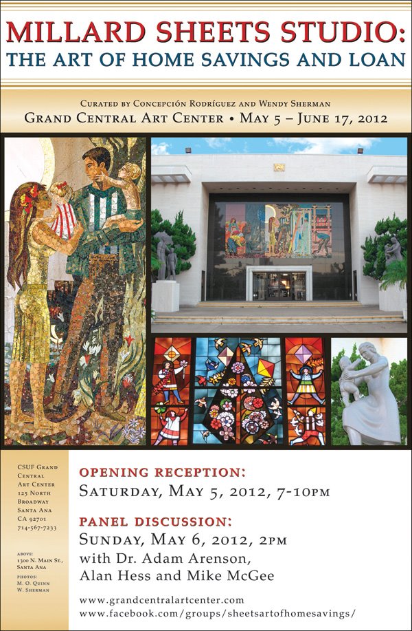
This week, I encourage one and all to come to the gallery show at the Grand Central Art Center in Santa Ana, showcasing the art of the Millard Sheets Studio at six Home Savings and Loan locations.

I will be presenting my research on a panel this Sunday, May 6, at 2:00 p.m., alongside noted architectural historian Alan Hess. I have been working with the exhibit organizers Concepcíon Rodríguez and Wendy Sherman for months, and I can guarantee this will be a great, ground-breaking show.

Join us!

Home Savings in New York – the TV Commercial

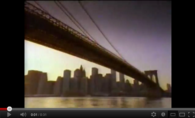
Home Savings of America TV commercial, 1992, accessed on YouTube

Home Savings of America TV commercial, 1992, accessed on YouTube

How did Home Savings/Savings of America express its affection for communities after they stopped paying for expensive artwork? Teresa Fernandez helped me again with a tip that some of the old Home Savings commercials can be viewed on YouTube.

Here, over a saxophone’s slow wail, images of multicultural New York flash by: the Brooklyn Bridge; a checker cab; Vesuvio Bakery; older (Italian?) men playing bocce ball;  a baptism in a Catholic cathedral; a (Chinese?) girl whirling fans; a mother and son lighting Chanukah candles in the window; an African American band; an (Irish?) family dressed to parade with bagpipes; and then a return to those old men.

The commercial’s text, with pauses that make it feel like a poem, reads:

New York.
It’s a city
not just of people,
but of traditions,
that preserve the past
and enrich the present.
At Home Savings of America,
the nation’s largest savings bank,
we have a tradition
of conservative investing
that has made people like you feel secure.
for more than a hundred years.

In my mind, this is an exact continuation of the themes in Richard Haas’s Forest Hills mosaic and the general use of art and architecture to ground Home Savings, using quintessential (almost bordering on stereotypical) images of New York City and its traditional ethnic residents to express a sense of home, evoking personal routes and stories of migration through the city for those customers elsewhere, and a sense of pride for New Yorkers.

Home Savings put the tagline “Peace of mind since 1889” on its shield for many years — despite the fact that Howard Ahmanson only became the majority shareholder in the savings and loan in 1947.   I see the same here, with a new bank determined to prove itself as an old, reliable friend. I find it very well done, the sentimentality full but not overdoing it, the “conservative investment” reassuring. And now, just like the mosaics, this 30-second commercial is now its own fascinating window on the past.

Lion of the Valley: Betty Davenport Ford at the Encino Home Savings

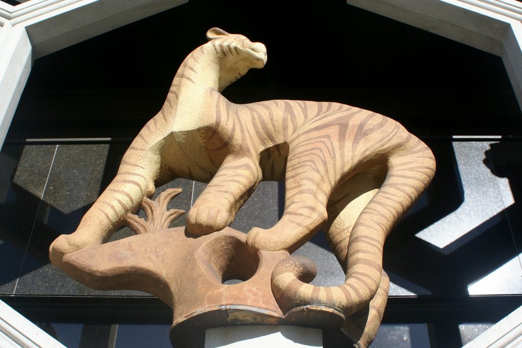
Betty Davenport Ford (lion) and Tony Sheets (grille) for the Sheets Studio, Encino, 1976

Betty Davenport Ford (lion) and Tony Sheets (grille) for the Sheets Studio, Encino, 1976

The last Home Savings and Loan completely conceived by the Millard Sheets & Associates, in concert with Frank Homolka & Associates as the architects of record, was the expansion and renovation of the Encino branch at 17107 Ventura Blvd.

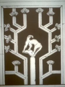
Sketch of mountain lion and grille, Encino, 1976

Sketch of mountain lion and grille, Encino, 1976

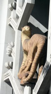
This branch has practically a whole wall of stained glass, mosaics inside and out (though the interior vault mosaic is now hidden), a large interior mural, and statues in niches — as well as a pair of ceramic mountain lions, enclosed in decorative grilles. Given the volume and variety of Sheets Studio artwork in this branch, it may be the most comprehensive look at the Sheets Studio’s production, given the variety of subject matter as well as media.

The year 1976 was one of the busiest for the Sheets Studio with Home Savings; we have seen artwork conceived or completed from that year in La Mesa, San Francisco, and Tujunga, with other projects in Alhambra, Redlands, Torrance, Buena Park, La Mirada, Lakewood, Simi Valley, Menlo Park, and Barstow still to come. It was also the era of the press-release or brochure at the opening, to give us a sense of what we see:

Designed for Home Savings by noted artist Millard Sheets, the two-story building occupies 12,030 square feet…

Two forty-foot[-]tall cast stone grill[e]s, designed by Tony Sheets, embellish the exterior while shading the large picture windows behind them.

Sculptress Betty Davenport Ford created two 1000[-]pound mountain lions which are ensconced on pedestals in the grill-work. Each larger-than-life animal was directly modelled from clay, slip-glazed and fired. They represent some of the largest works of this kind ever executed.

Like Sam Maloof, Martha Menke Underwood, and some of the other of the very best Pomona Valley artists, Betty Davenport Ford spent a period of her career contributing to the Sheets Studio artwork before dedicating herself completely to a solo career, creating sculptures of the natural world, distinctively stylized. At 88, she is still involved with the world of art ceramics, and her work is present in museum collections around the country.

Davenport and T. Sheets, mountain lion and grille, Encino, 1976

Davenport and T. Sheets, mountain lion and grille, Encino, 1976

These lions provide an interesting twist on the idea of connecting to the community. The winged lion of St. Mark, as seen in Venice, Italy, was the symbol of Home Savings, but this large cat is a local–to this day, the San Fernando Valley is sometimes visited by the region’s mountain lions, this big in the minds of the suburbanites who encounter them (though not this large in reality.)

I have to think more about if the art of the Encino branch has a unified narrative–from mountain lions to working men and women, to farm animals and birds to a cowboy on horseback–but the lion could mark the earliest, primeval sense of the valley, especially given the local La Brea tar pits, and the remains of the megafauna–saber-toothed cats, wooly mammoths, dire wolves, etc.–that were found there in number. It takes the winged lion and says hey — take a look at this local lion instead!

Though partially hidden by trees now, these lions in Encino announce proudly how Home Savings would guard that money.

Millard Sheets’s Gateway to the Pacific and the Home Savings Style

Millard Sheets and Sue Hertel, Gateway to the Pacific, West Portal, San Francisco, 1976-1977

Millard Sheets and Sue Hertel, Gateway to the Pacific, West Portal, San Francisco, 1976-1977

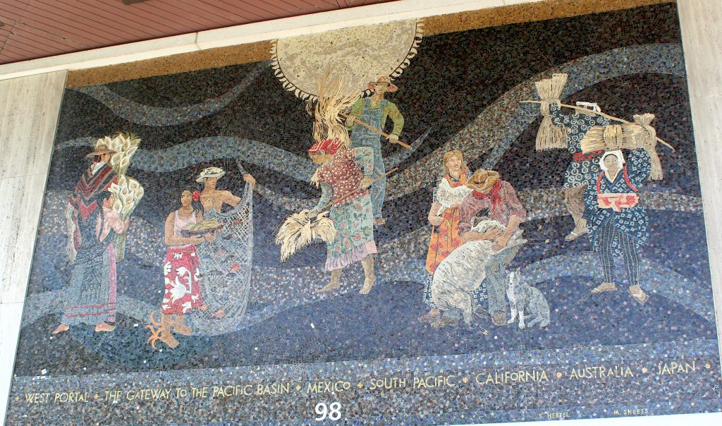
Following up last week’s post and staying at San Francisco’s West Portal, if we walk outside, we encounter the most international of the Home Savings artworks, the Sheets & Associates “Gateway to the Pacific” mosaic.

The concept of a Pacific Rim, interconnected by commerce, entertainment, migration, and cultures, is an old one — statues in Easter Island suggest that these connections may predate Christopher Columbus’s voyages. But the 1970s saw a return to thinking about the Pacific Rim, with President Nixon’s visit to China, the rise of the Japanese economy, and the start of the “Asian tigers” economic phenomenon, and the flood of goods made in Japan, Taiwan, or Hong Kong.

The representative figures from each Pacific Rim nation come in pairs, a man and a woman, and each is engaged in what might be seen as a representative task, a labor linked to agriculture. From what I can tell, the Mexican couple carries flowers (calla lilies), the South Pacific pair a fishnet and fruit; the Californians wheat (I think; very hard to tell); the Australians care for sheep; and the Japanese carry also carry grain bushels.

The figures do not interact, and do not appear in geographic order; four of five men wear sunhats. Only the Japanese woman looks out at us; all the rest are engaged with their labor, or the labor of their partner.

This is a very unusual work, not only for the international theme. Besides the large sun overhead, which (given its inclusion in the Beverly Hills, Encino, and other mosaics, is a kind of Home Savings theme), there is no way to look at this and say, immediately, this was a Home Savings artwork.

What it looks more like was the artwork that Millard Sheets created after his trips around the world, and in commissions for United Air Lines and other international-themed places. Though exhibits like the LA County Fair exhibit organized by Tony Sheets highlighted this international side of Sheets’s work, it seems a world away, literally and figuratively, from the standard Home Savings topics and designs.

Given the radically different artwork that Sheets, Hertel, and Denis O’Connor created independently, outside of the context of the Home Savings work, makes me wonder where the “Home Savings style” originated. Sheets did the original designs, and so the answer lies with him, in one sense, but — the early works like Beverly Hills also feel atypical, in their way, and Sheets, in any case, had to have some idea of what Howard Ahmanson wanted for Home Savings.

Sheets chose California community themes, but were those works only possible in one style? Clearly not. Mosaic makes certain demands; so stained glass, and so Sheets and Hertel, painters by preference, made concessions to form. But the differences so evident here — the colorplay in the tiles, the abstracting lines, the sun are the same, but the figures seem cut out of a totally different scene.

Which Home Savings artworks seem not like the others to you? (I have another in mind, which we can see next week.)

The Late Work: Hertel and O’Connor and a Strange Bank Building in Coronado

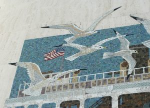
Susan Hertel and Denis O'Connor, ferry, Coronado, 1985

Susan Hertel and Denis O’Connor, bay commuter ferry, Coronado, 1985

On Thanksgiving Day, while my toddler napped, my father and I drove over the San Diego-Coronado Bay Bridge to take a look at the former Home Savings (and now, former Petco) at the center of the business strip on Orange Avenue in Coronado.

Un-Sheets architecture: the former Coronado Home Savings

Un-Sheets architecture: the former Coronado Home Savings

When I first heard that a former Home Savings had become a Petco, I couldn’t figure out how that could be; thinking about the kind of grand lobby in the original banks the Millard Sheets Studio designed for Howard Ahmanson, I could not figure out how that would work.

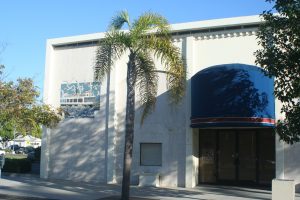
When I arrived to see this building, however, it made a bit more sense — in part because this was hardly a typical Home Savings building. It was a corner property on the main business thoroughfare, with a sizeable parking lot, but the site had been misused by those that built it; the corner was given over to parking, and the building — not, clearly, built as a bank originally — squeezed into a row of storefronts. It had been a not-very-prominent bank, then a too-small Petco; now it sits empty.

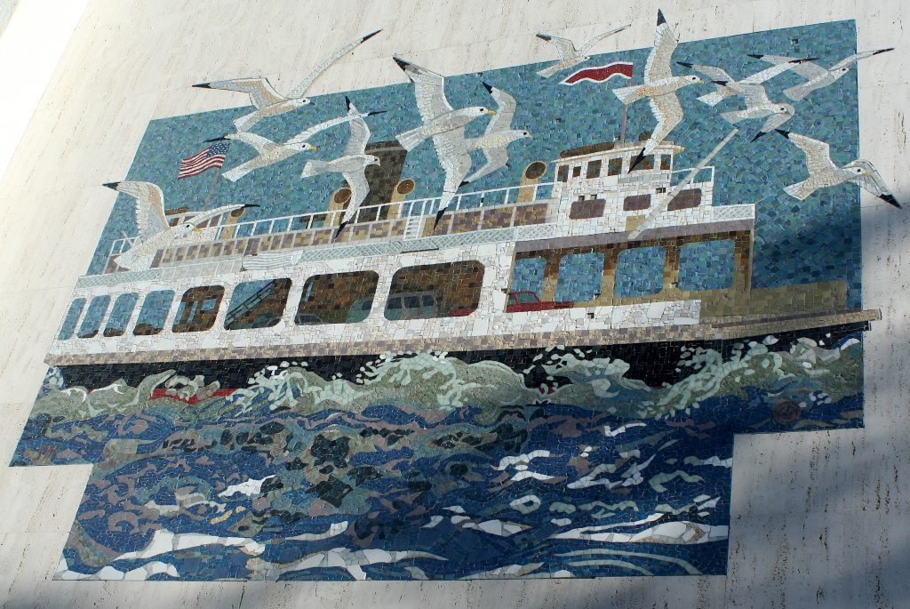
The artwork, which my files can date to 1985, is small, a modest addition to this preexisting building. But the work does hold some of the earlier themes — a joyous and iconic local experience, crossing the commuter ferry to San Diego — and a few seeming technical innovations.

Detail of the wing, cut into the travertine, 1985

Detail of the wing, cut into the travertine, 1985

As I noted a few weeks back, Alba Cisneros had described the difference between cutting the travertine around the small elements at the edges of a rectangular piece of artwork vs. finding ways to “cheat” it, by using broken travertine like mosaic pieces or simply staining/painting those edge details onto the building.

Despite the late date of this work, Hertel and O’Connor nevertheless were able to carefully cut the travertine to match up with the gulls’ wings, a few matching the rectilinear lines but the one at the center top bolding taking its mosaic wing at an angle, at great cost but greater beauty.

Even though the color palette of this mosaic is lesser — fewer offsetting Color Field-like choices — the craftsmanship on these tiles on planar surfaces — the sky, the rocks, the birds — seems unsurpassed, so dynamic and intricate, compared to some of the earlier compositions.

A nice sight to see over the holiday, and a nice reminder the questions of complexity, cost, theme and color do not simply rise and fall in the history of this artwork.

Technical Disappearance

Hello–

My laptop has what IT says is a hardware issue. So they took it away, for at least a week — with all my notes inside. (Don’t worry, I have a backup.)

So the Image of the Week will have to take an unscheduled vacation — but we should be back in business in the weeks ahead…