This week I have had a chance to catch up with some of my fellow scholars interested in the art and architecture of banks, whether in the human story of their creation and management or the architectural story of how technological innovation — from check processing to ATM cards — changed the physical shape of banks. It is nice to find such a community working on telling these overlooked stories!
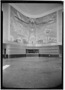
One beautiful bank with its own set of surprises is the Pomona First Federal location at Indian Hill and Foothill, in Claremont. Driving by quickly, the bank has all the hallmarks of the Home Savings locations — the travertine, the mosaic, and atrium-like spaces enclosed by columns and facing the parking lot and a prominent corner. Inside there is a prominent painting of local history, much like at another former Pomona First Federal location (the new site for AMOCA).
Indeed, the lotus-like capitals seem unusual, but not out of the realm of the possible for Home Savings. And the bank’s (former) name is prominent in the artwork — not quite the Home Savings shield, but the same sort of permanent corporate marker, though one left in place here.
The records suggest these similarities are no coincidence, and they are not evidence that Sheets could only think in one mode. This was a rejected Home Savings design — a bank repurposed for the Claremont site from another location. The artwork seems to relate to the Pomona Valley — the interior image is a rich scene of Native Americans gathered in circles around wigwams and a horse corral, credited by many to Nancy Colbath despite the Sheets signature. So it seems likely Sheets simply borrowed an architectural design from a project Home Savings did not build, and then drew on his deep affection for his home community to quickly provide appropriate imagery.
But, looking back from our era of non-compete clauses, and for a project so linked to Home Savings’s image, it is remarkable that the Sheets Studio could do this work for Pomona First Federal and similar echoes in the work for Texas banks. Home Savings had not reached those communities, but as it expanded nationally, one wonders if these close copies ever became an issue.
It clearly was something that Pomona First Federal looked upon with pride, as a later renovation reveals. When PFF was ready to install a drive-up ATM station in 1982, they contacted Denis O’Connor, the Sheets Studio mosaicist who had done the tile work and contributed to the design of the original mosaics.
O’Connor provided a matching image — another Native American figure on a black-and-white horse, back turned toward the snowy mountain, again walking through the wonderful M.C. Escher-like leaves that evoke bird shapes above the desert plants. I assume it was satisfying to see such a commitment to continuity, when the experience of banking went from entering a temple to commerce and commercial relationships to the chance to grab your cash without getting out of the cash.
So much of what this art and architecture can offer is that sense of continuity–even as the bank names change. ( M. Danko has good images.)
*
This will be my last regular post for the summer; the academic year is winding down, so I will be traveling more, researching more, but not in a position to post easily every week.
I know I owe our faithful readership a definitive list of these banks, their addresses, dates of construction, and current status — I am working on it, and I welcome your input. I also hope to get more interviews done, with former Home Savings employees, and to seek out more resources. And I will provide a better index to this site, more than just keyword searching.
I will be back regularly on the blog in August, and with any great finds in the meantime. Do keep commenting and checking back, though, for more about these treasures.

