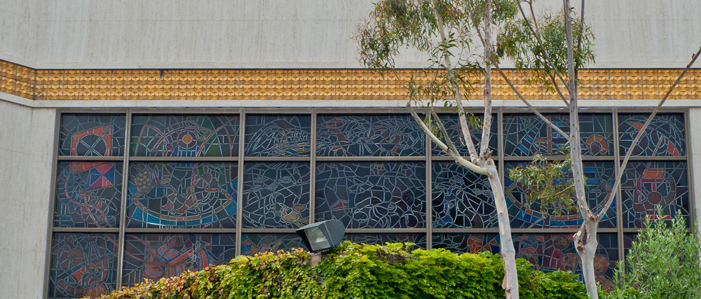
Sheets Studio, bird, mosaic detail, Redondo Beach, before 1961
The Home Savings branches were expertly sited — placed on prominent corners, so drivers could know, instantly, which financial institution it was. The original branches had gold tiles and brightly colored mosaics, like these birds. (The mosaic seems to involve less sophisticated cuts, and the location has no file in the Millard Sheets Papers, suggesting it was completed before 1961.) Funny to see the gold tiles replaced by the brown-and-red colors of Wells Fargo!

Sheets Studio mosaic and building design, Redondo Beach, before 1961
Of course, other banks and savings and loans understood the value of a location on a prominent corner as well. The rounded-square signs over rounded-to-the-corner buildings mark the former Crocker National Bank locations. Even though Crocker was acquired by Wells Fargo, I find that many of their former locations in Los Angeles are now Bank of America, a result of the waves of bank expansion and consolidation that have shaped banking since the 1980s.
This is a similar story: though Wells Fargo also owned the American Trust Company, and hence has a connection to other Sheets Studio artwork, I think this location is the only former Home Savings that is now a Wells Fargo, and the only location with artwork completed before 1980 that is a financial institution other than JP Morgan Chase.
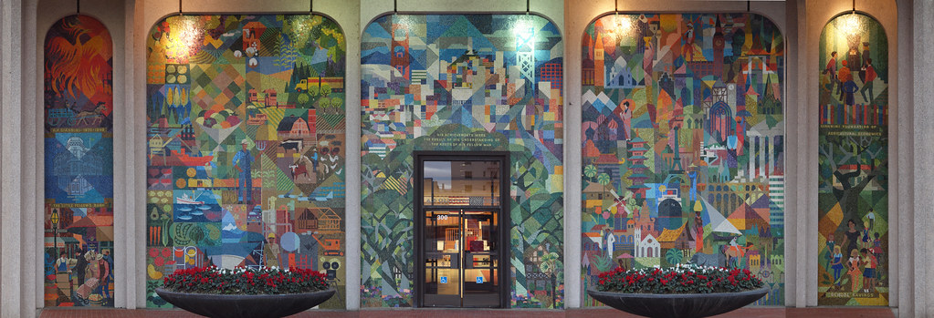
Louis Macouillard (design) Alphonso Pardinas – Byzantine Mosaics (fabrication), Bank of America Mosaic in San Mateo. Photograph by Franco Folini, 2010, via Flickr.
I assume Wells Fargo and Bank of America had internal conversations about the Home Savings commitment to art, history, and community, and whether their banks needed to do similar work to compete — the San Mateo branch of Bank of America honors the bank’s founder, A. P. Giannini, with a front facade covered in mosaic designed by Louis Macouillard. But, despite their more public archives, I have yet to hear about records of these conversations. If you know of any, do let me know!
*
Happy Holidays! The blog will return with new posts in January.